I need some opinions on this
Posted: Mon Mar 26, 2007 7:40 pm
OK, so our CFO decided a few weeks ago that we are going to have this big joint Finance/ITS "Opening Day" event thing. We've been split into teams of about 7 people and tasked with coming up with names to rally around and decide a track of events we want to take part in.
The whole thing is kind of a boot to the head. Part of me is going to take great glee in his "picnic styled fun" thing since we've been encouraged to wear shorts and tshirts and just have fun. This cracks me up because a large majority of my co-workers have no idea that I'm covered in tattoos. I think it will freak out many of them.
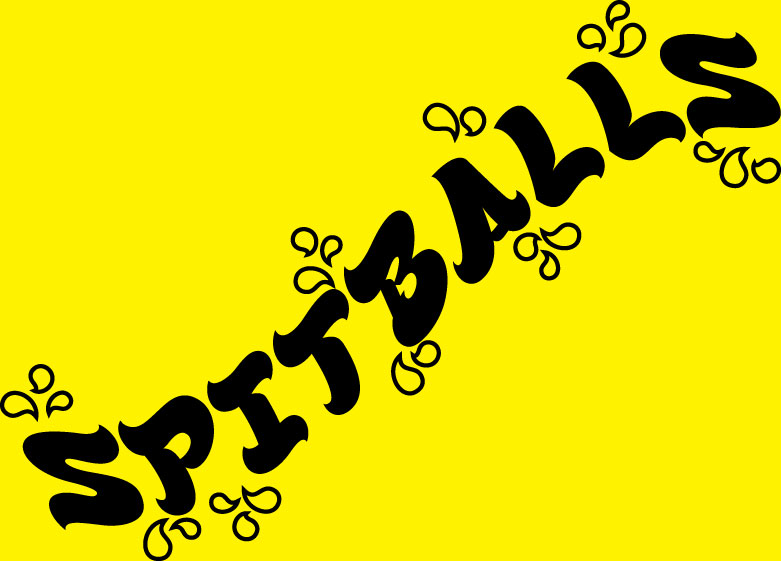
Soooo, because I was unable to attend my "team meeting" due to "real" meetings on Friday, I got elected captain. The shitty thing there is that they even went ahead and chose a name rather than let me work that out. We're the spitballs. Not a name I would have chosen, but not one I'm opposed to (did I mention this entire event is baseball themed?).
Today, while waiting for one of my databases to be refreshed, I pulled open Illustrator and cranked this out (don't worry squeezle, your design project is next).

It feels like something is missing to me, but I just can't put my finger on it. Any thoughts or suggestions? Thanks!
The whole thing is kind of a boot to the head. Part of me is going to take great glee in his "picnic styled fun" thing since we've been encouraged to wear shorts and tshirts and just have fun. This cracks me up because a large majority of my co-workers have no idea that I'm covered in tattoos. I think it will freak out many of them.
Soooo, because I was unable to attend my "team meeting" due to "real" meetings on Friday, I got elected captain. The shitty thing there is that they even went ahead and chose a name rather than let me work that out. We're the spitballs. Not a name I would have chosen, but not one I'm opposed to (did I mention this entire event is baseball themed?).
Today, while waiting for one of my databases to be refreshed, I pulled open Illustrator and cranked this out (don't worry squeezle, your design project is next).

It feels like something is missing to me, but I just can't put my finger on it. Any thoughts or suggestions? Thanks!
