Page 1 of 2
Oh shit, Justin's getting creative again
Posted: Tue Apr 11, 2006 12:11 am
by aquaphase
Choices Choices Choices.
1.
2.

3.

4.
5.

6.
7.
Posted: Tue Apr 11, 2006 12:49 am
by ree-ree
well, 100% vote for #2!

I like the subtleness of the brown color combo better than the too bright.
(I want a shirt like that.)
Posted: Tue Apr 11, 2006 3:56 am
by mere1975
I like the subtleness of the brown color combo better than the too bright.
That's because it follows Itten's color postulate about the contrast of saturation. Or rather, it's the only one in that batch not to follow Itten's simultaeous contrast theory, formed when the boundaries between colors perceptually vibrate.
- Mere "color theory at work" 1975
Posted: Tue Apr 11, 2006 4:01 am
by aquaphase
yeah, squeezle really didn't like #4.
Posted: Tue Apr 11, 2006 4:33 am
by mere1975
yeah, squeezle really didn't like #4.
#4 reminds me of Roach.
- Mere "not sure why, maybe he wears a shirt like that or something" 1975
Posted: Tue Apr 11, 2006 10:01 am
by James
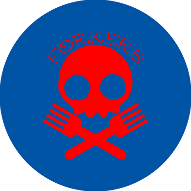
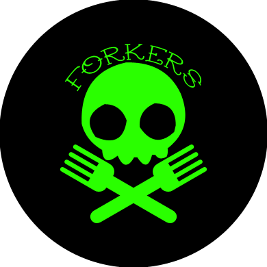
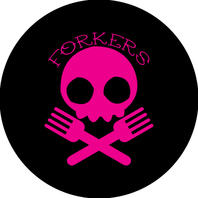
while i have no qualms with any of the above (I forgot which one I actually voted for) I would like to throw out: black skull and forks on white background.
Hell, I like all of them. You should get a whole bunch together and make an andy warhol-style art piece out of it.
Posted: Tue Apr 11, 2006 12:04 pm
by eebs
that reminds me, must check that our forkers shirts are ready for rumble on brighton beach tomorrow
![:]](./images/smilies/happybot.gif "happybot")
Posted: Tue Apr 11, 2006 1:04 pm
by sam
While #2 is a nice color combination, there is something retro-ish about it that doesn't say Forker to me.
Posted: Tue Apr 11, 2006 1:08 pm
by James
Posted: Tue Apr 11, 2006 1:20 pm
by ree-ree
I like the subtleness of the brown color combo better than the too bright.
That's because it follows Itten's color postulate about the contrast of saturation. Or rather, it's the only one in that batch not to follow Itten's simultaeous contrast theory, formed when the boundaries between colors perceptually vibrate.
- Mere "color theory at work" 1975
You just blew my mind

And I agree that it does look kinda retro and that might of been part of the draw.
Posted: Tue Apr 11, 2006 1:39 pm
by monet2u
3 for me....make it red/blk...it goes on my new ride.

Posted: Tue Apr 11, 2006 2:26 pm
by Phillyphonic
I like the subtleness of the brown color combo better than the too bright.
That's because it follows Itten's color postulate about the contrast of saturation. Or rather, it's the only one in that batch not to follow Itten's simultaeous contrast theory, formed when the boundaries between colors perceptually vibrate.
- Mere "color theory at work" 1975
Mere please don't bring color theory into this. I thought I left that shit behind in Foundation design back at art school. When you said Itten, I almost spontaneously combusted in my chair. I hated his stupid color books. Itten is an asshole.
What is worse than Itten is doing a grayscale with black and white gouache. It never mixes right, and i have the worst hand execution of all time. Probably burnt out motor skills from too much internet porn and twitch video games.
I failed like 4 grayscale projects. I'm a piece of shit.
Posted: Tue Apr 11, 2006 2:59 pm
by mere1975
Gouache rocks my lame ass.
I had so much fun mixing it, but we had a little trade secret: we added a drop of hand soap to it to make it glossy and smooth.
Maybe everyone knows that.
I just don't know a thing about the fine arts.
Color Theory class felt more like arts and crafts.
- Mere "no more Itten, I don't want anyone to get nauseous" 1975
Posted: Tue Apr 11, 2006 3:31 pm
by roach
yeah, squeezle really didn't like #4.
#4 reminds me of Roach.
- Mere "not sure why, maybe he wears a shirt like that or something" 1975
funny you saw that, it's my favorite... tied with #2. stupid ties. i don't believe in shoot outs so we'll keep em tied.
Posted: Tue Apr 11, 2006 3:57 pm
by Steveums
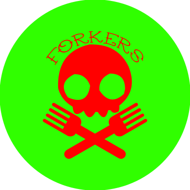
Just a thought... would no. 1 look better using the red and green colours in the forkers logo up there ^^ ?